UI & UX design case study — Responsive web app design
Introduction
About this project
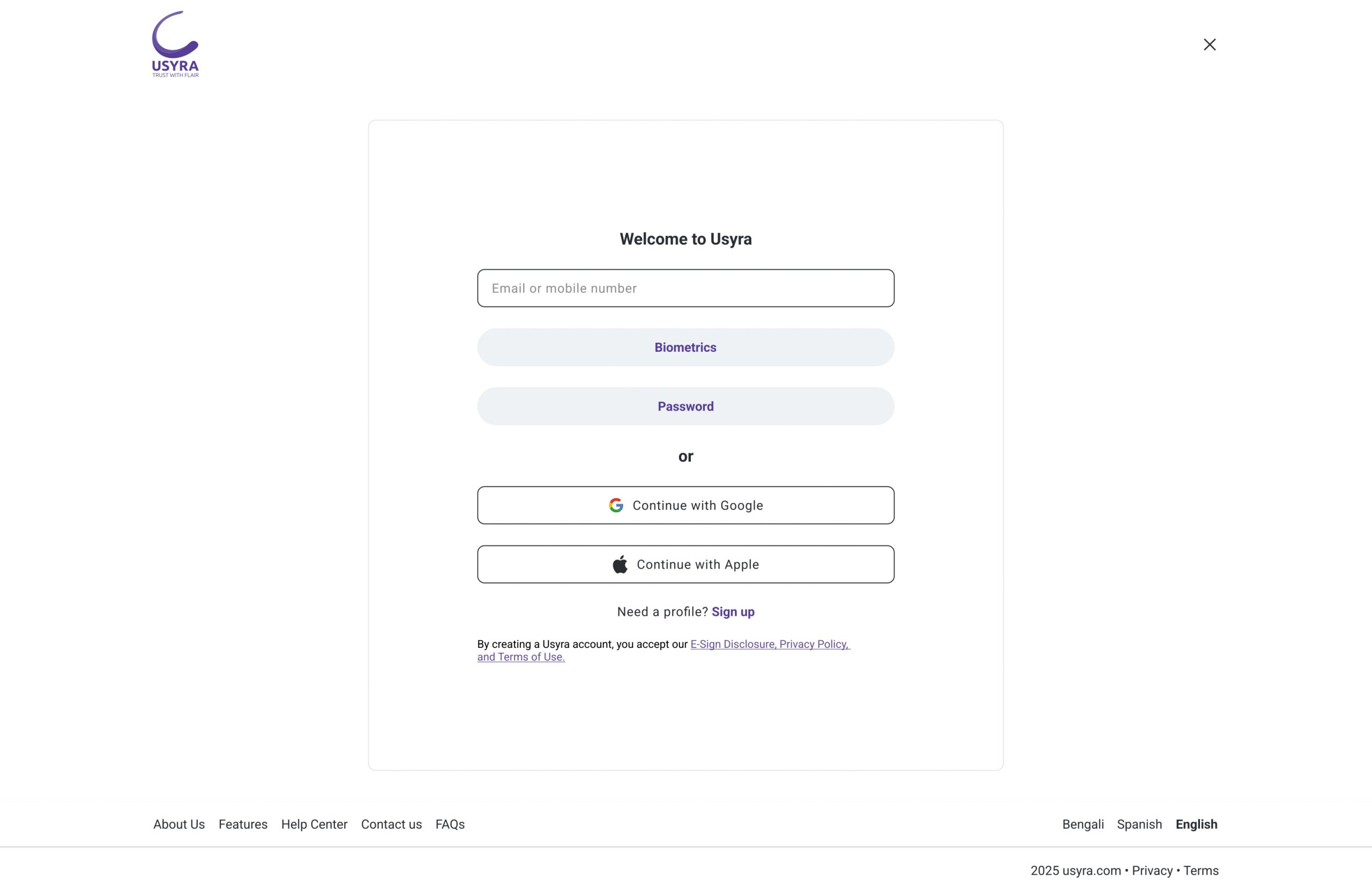
Usyra is a user-centered financial web app designed to make everyday money management feel simple secure and trustworthy. It reduces friction in digital payments so users stay informed confident and in control. Usyra targets users aged 16–45 mainly professionals freelancers and small business owners who need secure rapid and transparent money transfers.
Overview
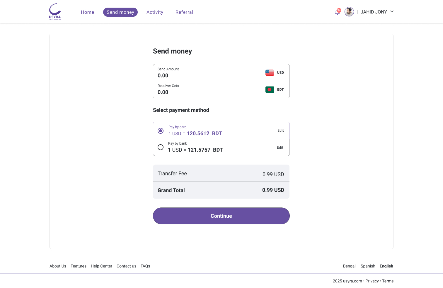
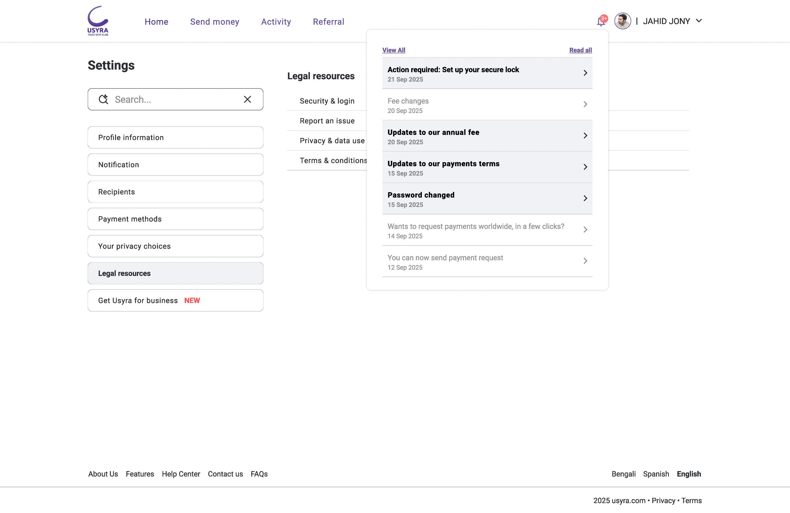
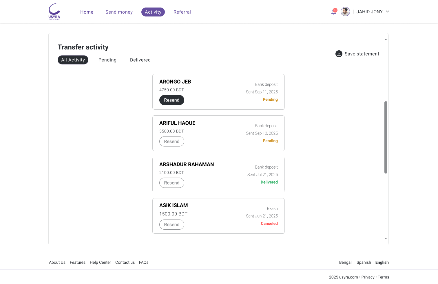
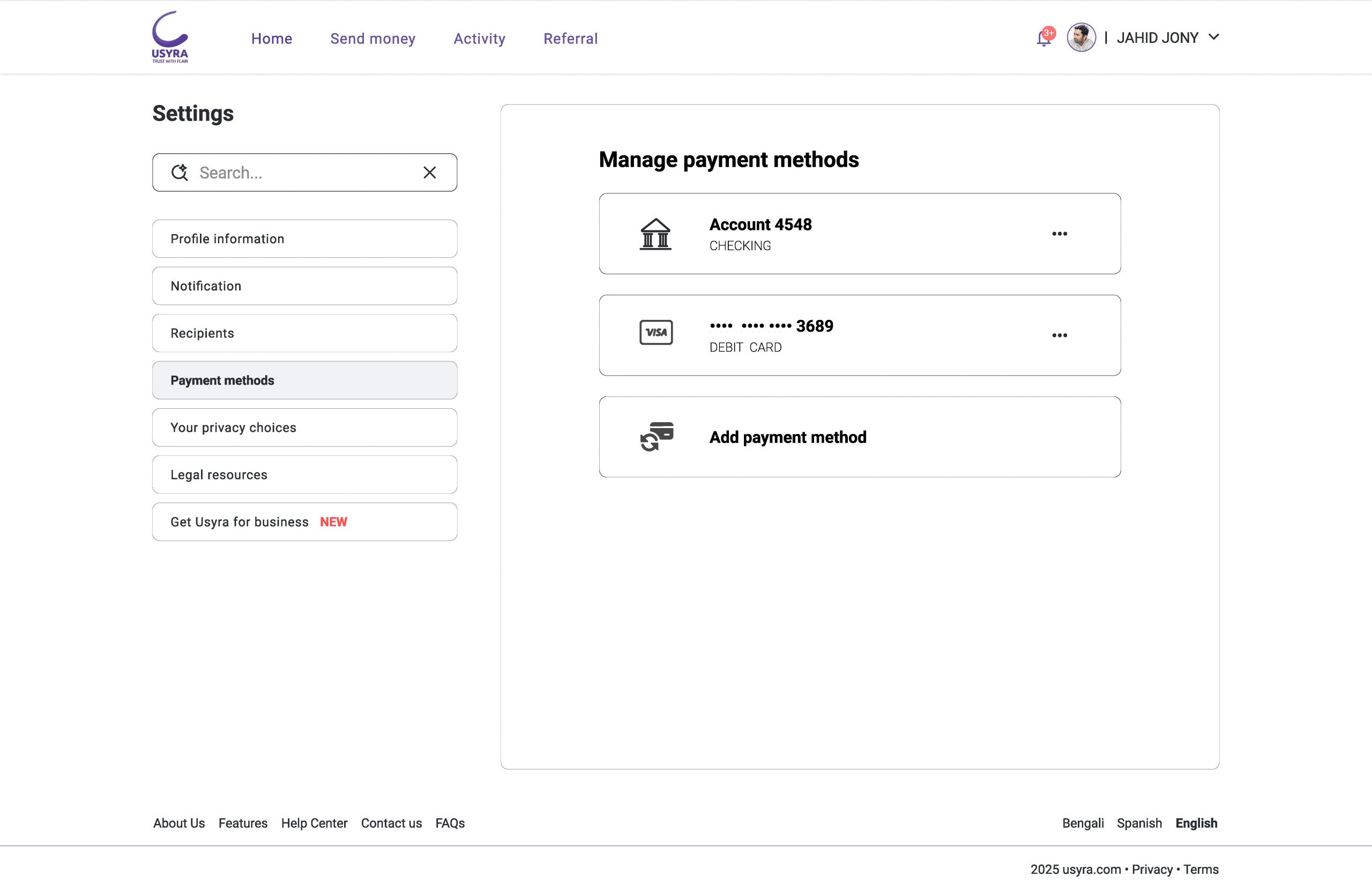
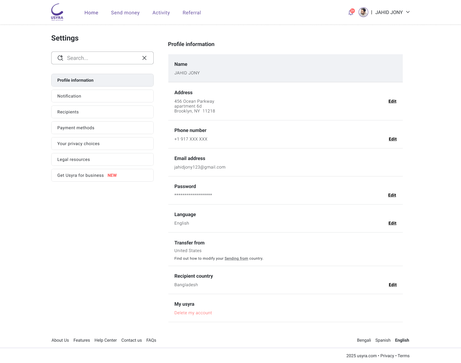
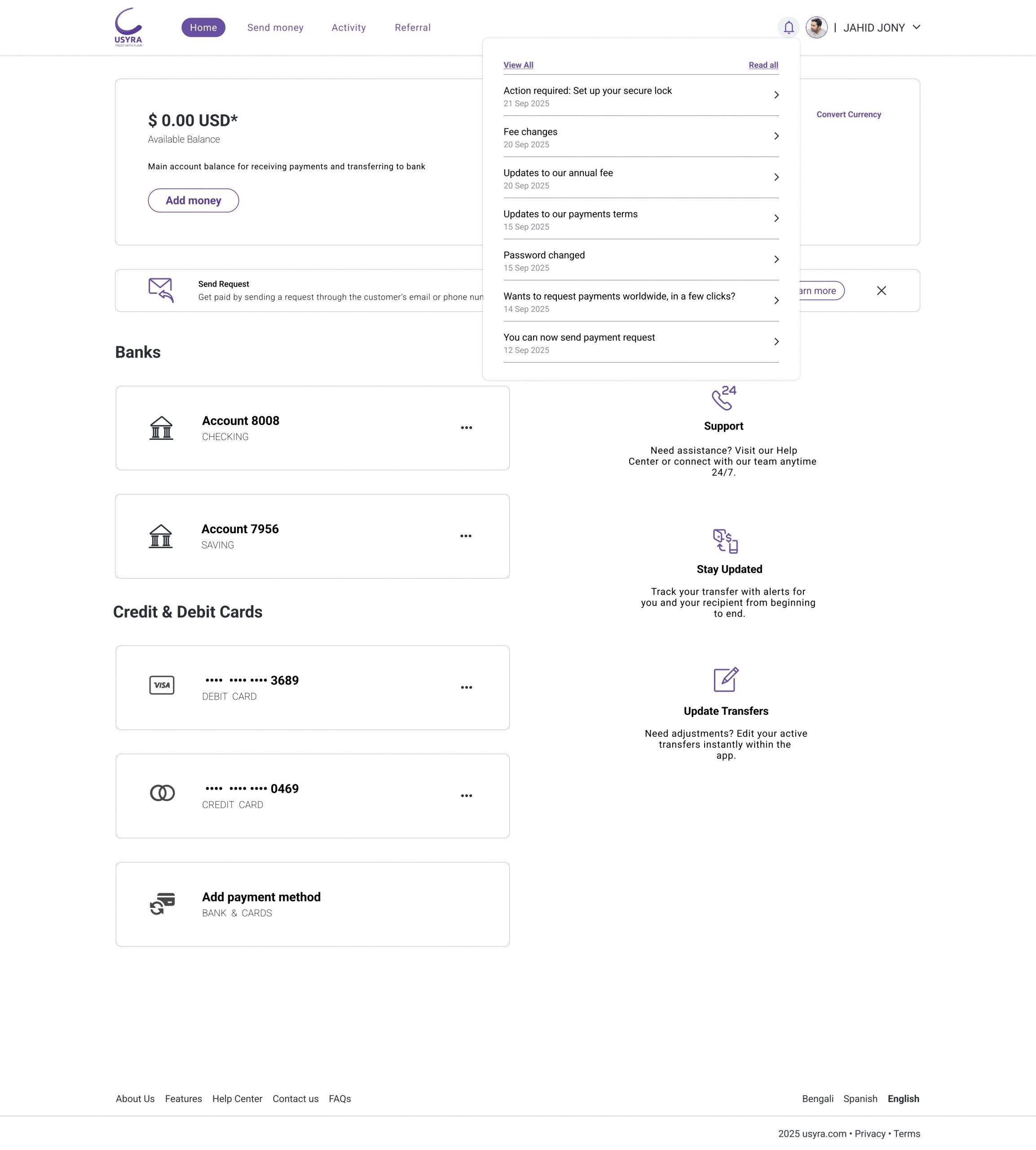
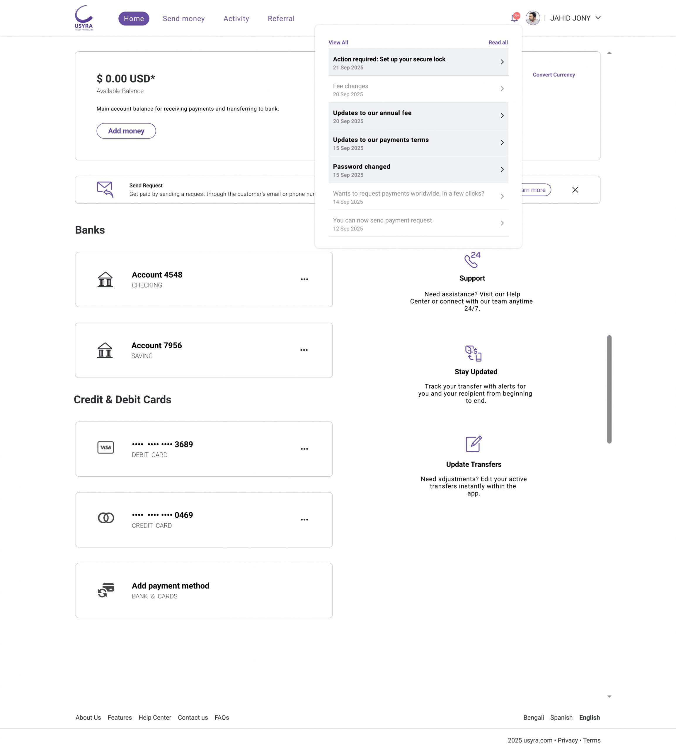
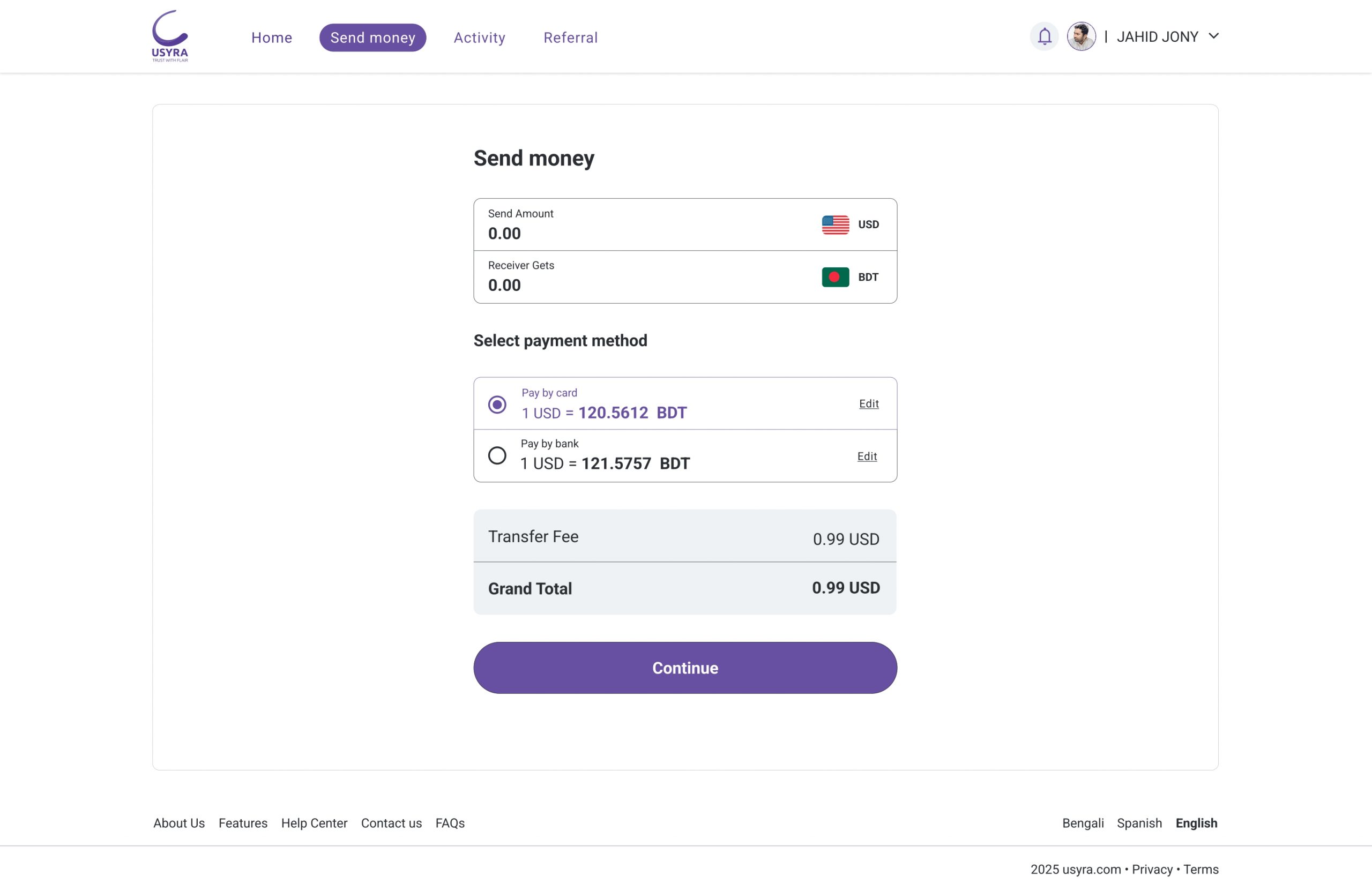
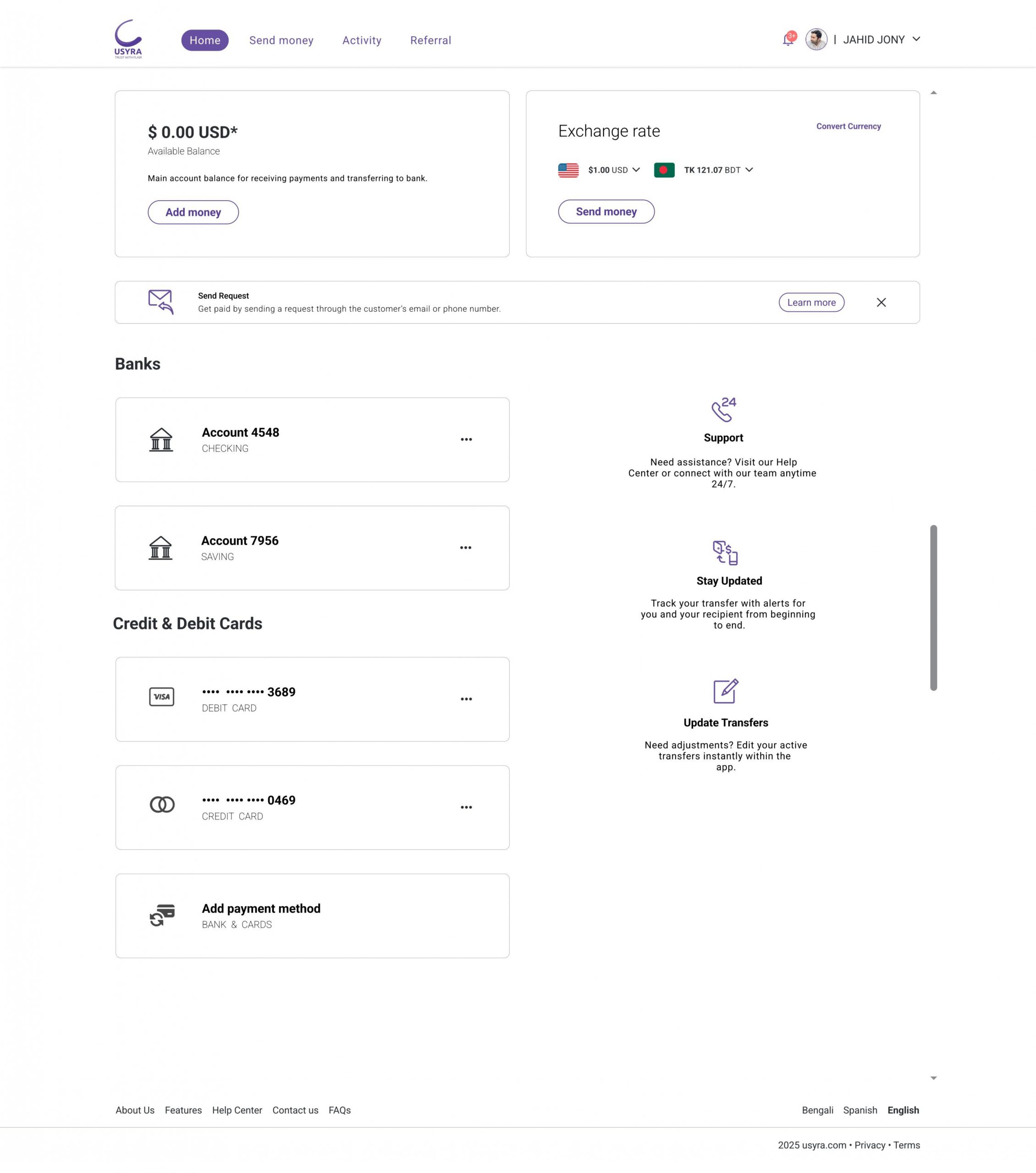
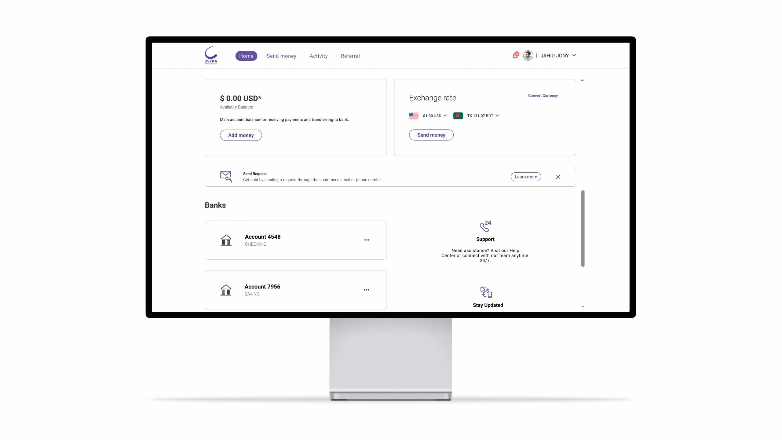
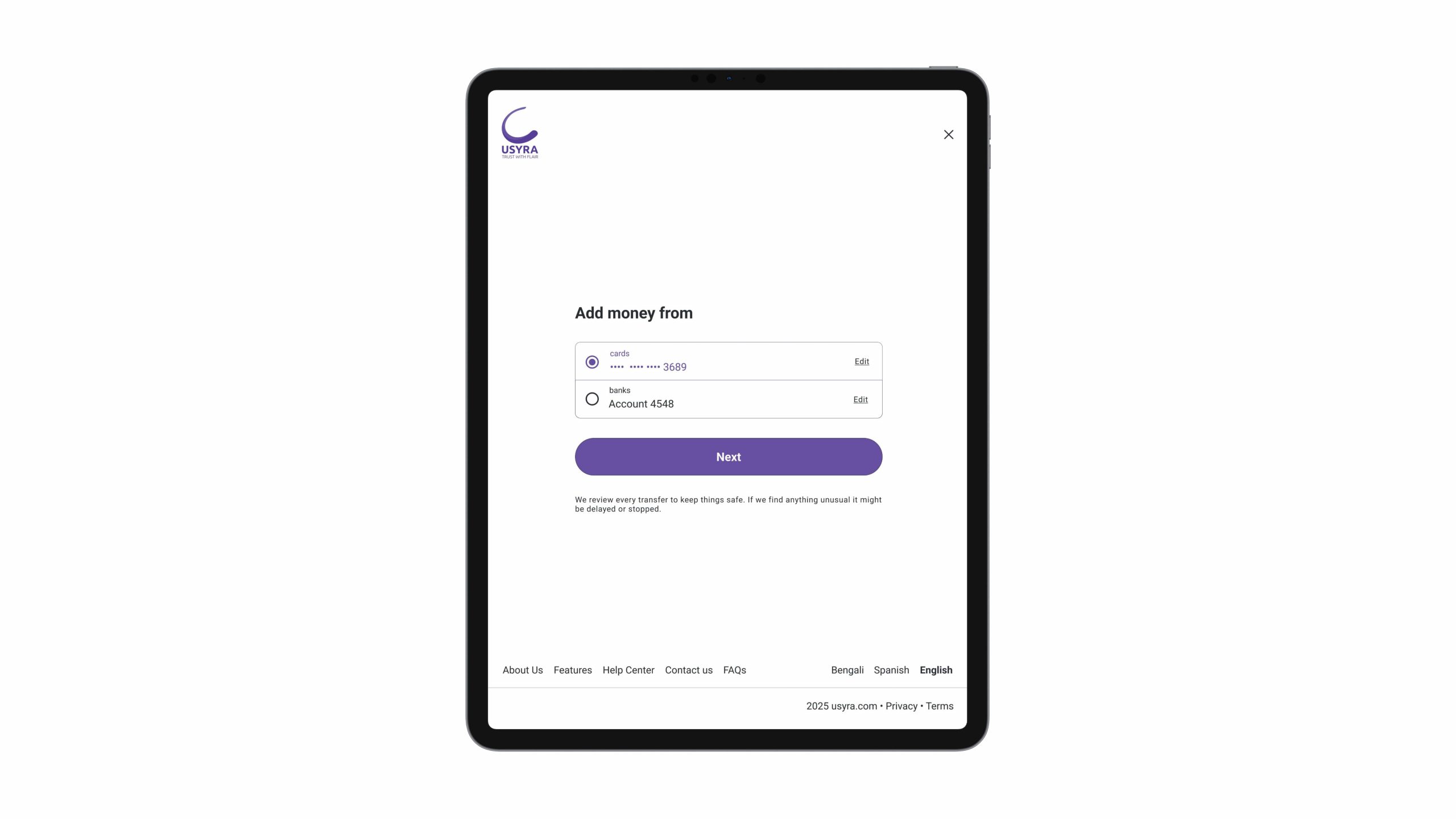
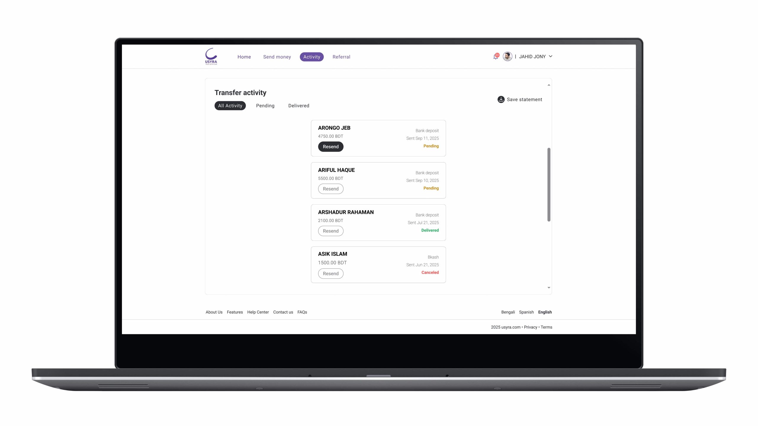
Usyra helps users send money, review transactions, manage payment methods and adjust security settings through a clean consistent interface. It’s built around three key features : Quick and secure moneytransfers an integrated banking hub and smart notifications and security alerts.
The story
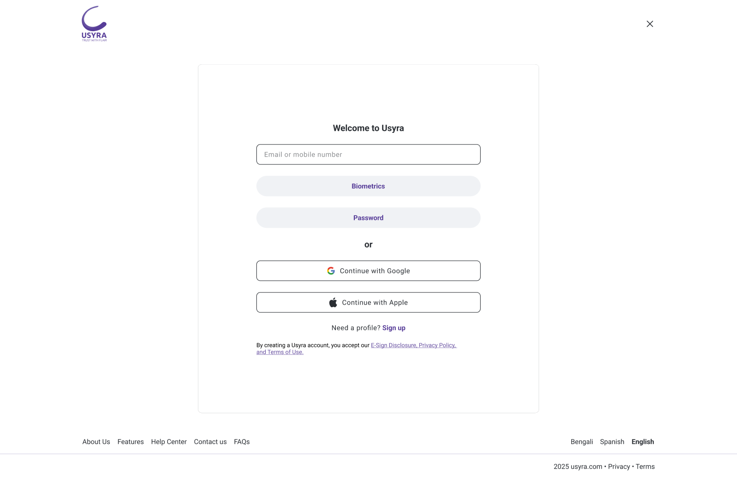
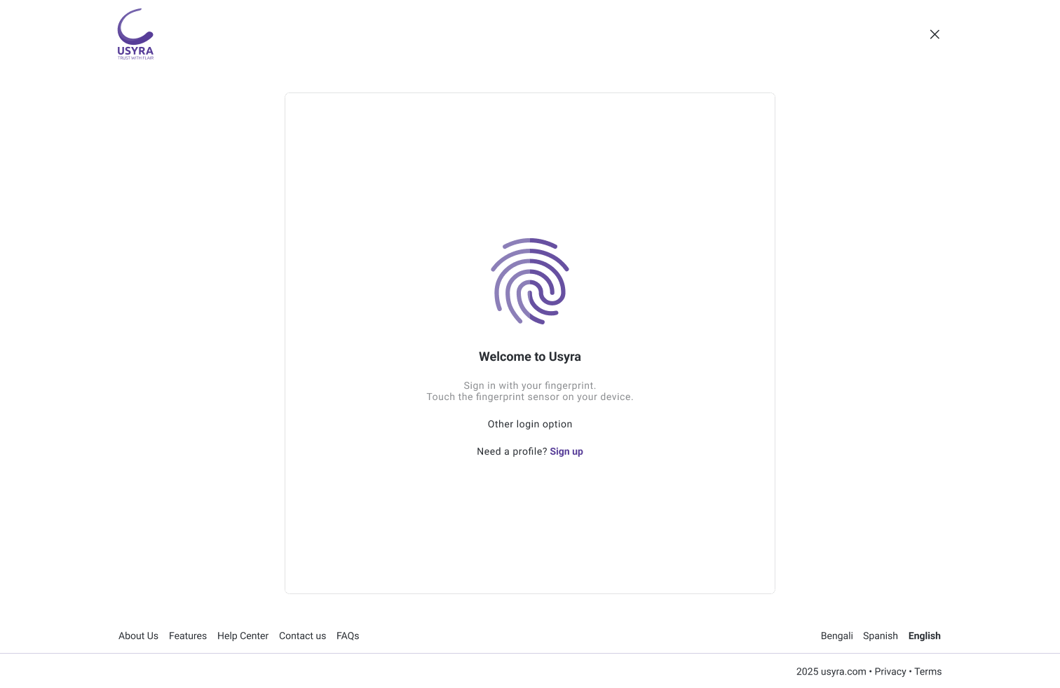
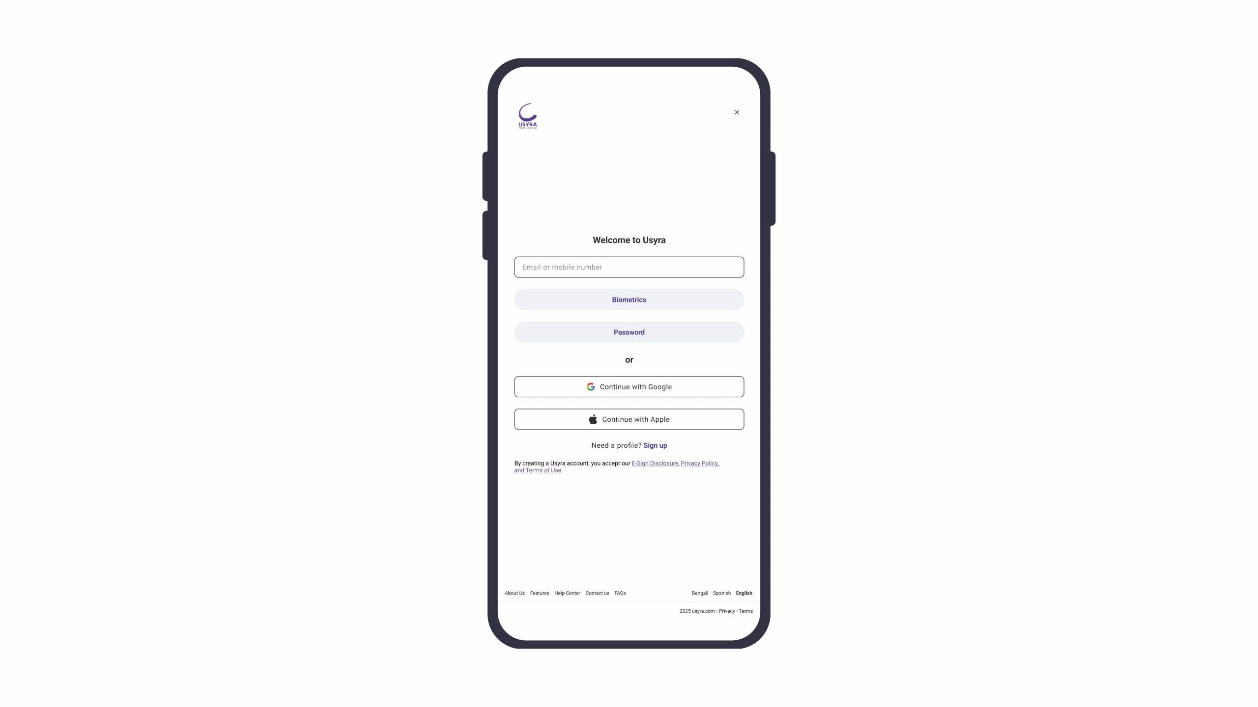
Usyra was created to solve common finance-app frustrations – unclear transaction feedback, complex onboarding and trust concerns. Through iterative design. It evolved into a calm experience powered by biometric sign-in, device verification, key-locker protection, End-to-End encryption, real-time alerts and easy bill-splitting for everyday use.
Platform
Usyra is a responsive web application built for desktop, tablet and mobile.
► Real-time transfer status + faster flow feedback.
► Consistent responsive design system.
Problem Statement
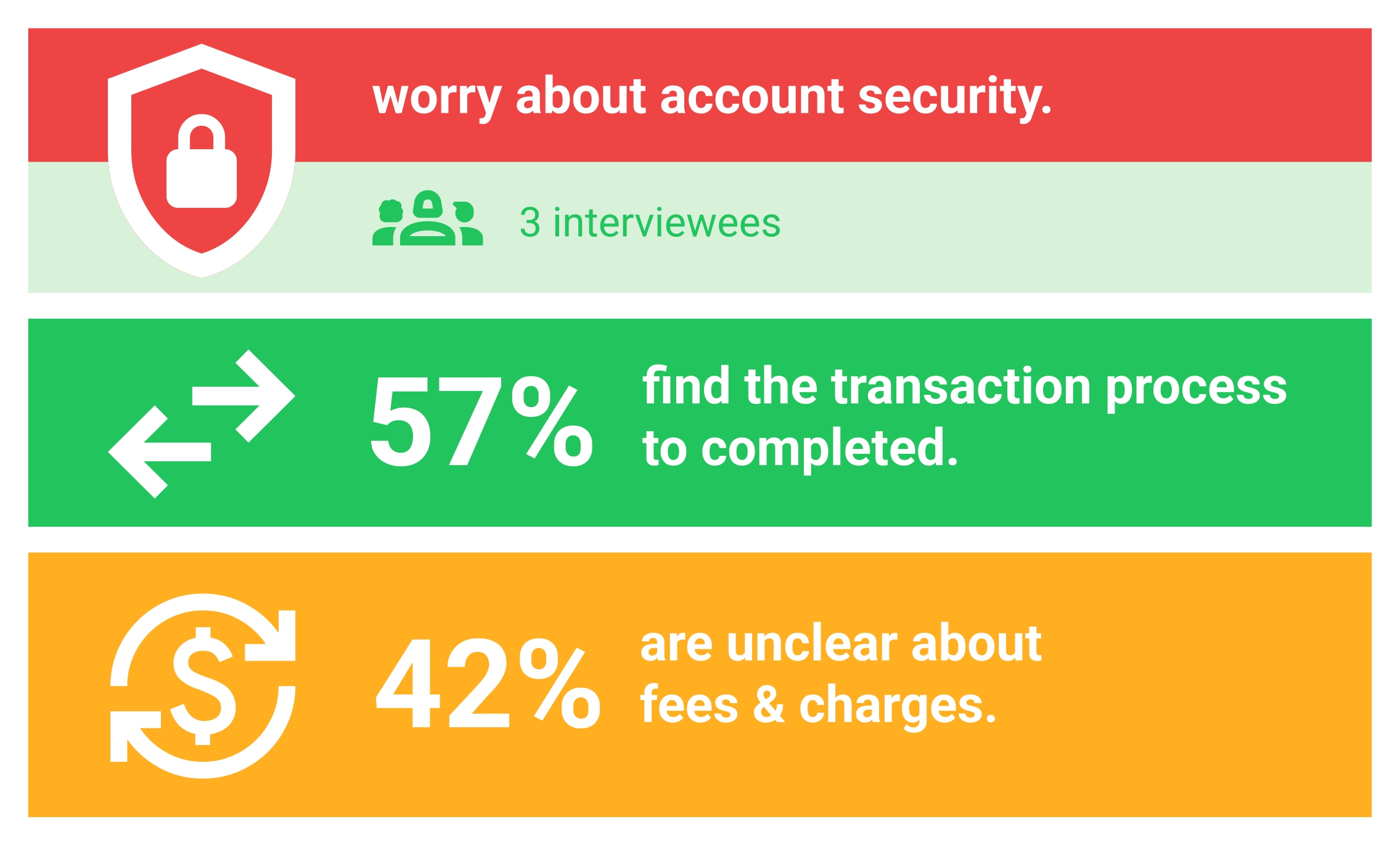
Usyra users need a secure, sensible way to do business because they fear online fraud find traditional payment methods inconvenient and want a faster, more convenient way to split payments and they send money in.
Solutions meet their expectations with enhanced security features, Provide seamless onboarding and seamless income allocation.
Competitive Analysis
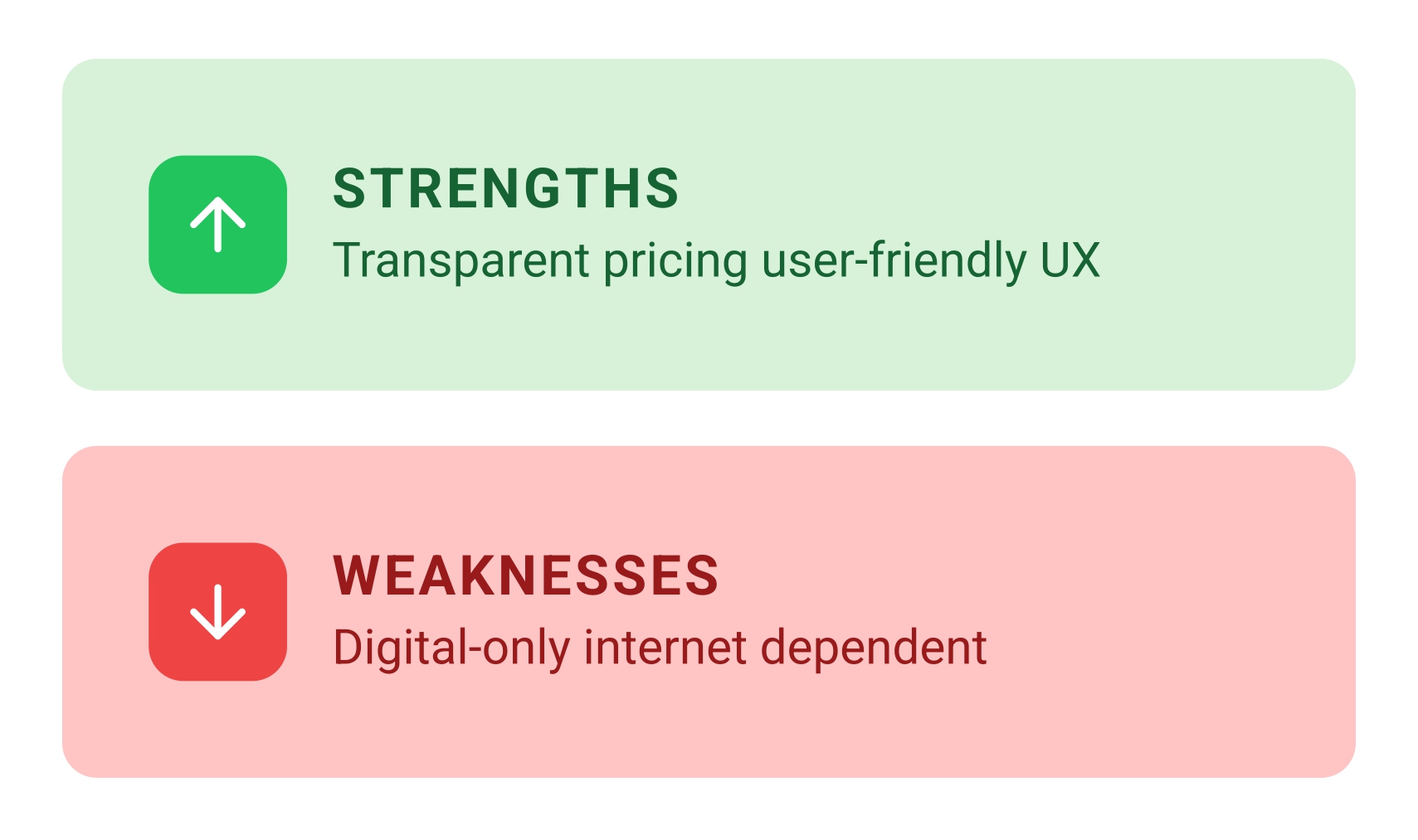
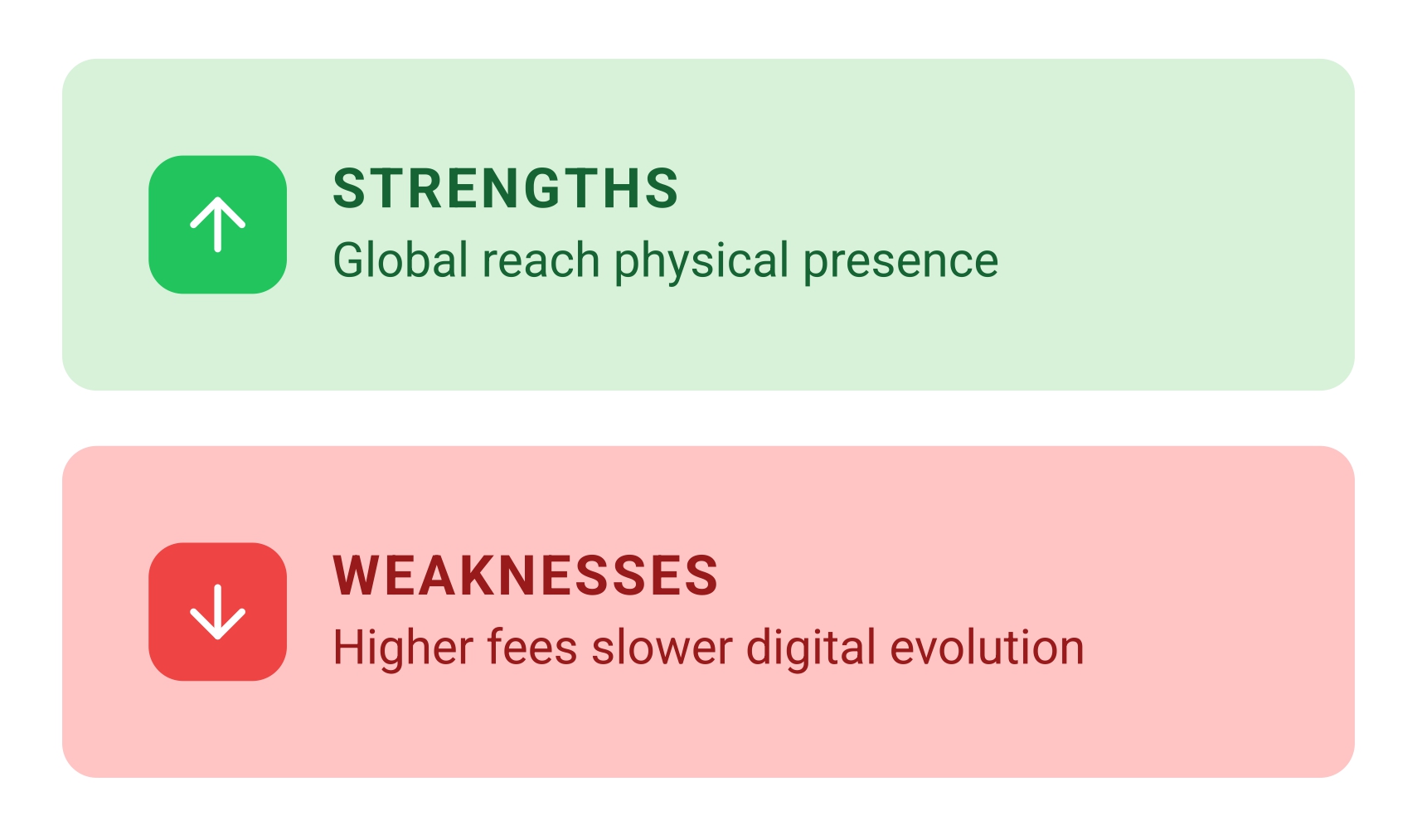
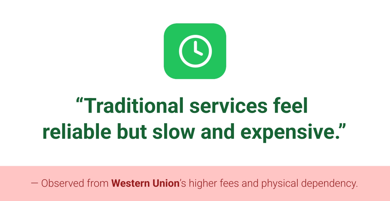
I have analyzed Usyra’s two competitors Wise and Western Union based on their market presence and features. A deeper competitive analysis was performed on Wise.
A busy user who cares about trust needs a simple and safe way to manage their money. Right now, financial apps are hard to understand, don’t work the same way on all devices and are risky, which makes it impossible to know where their money is.
Ideate
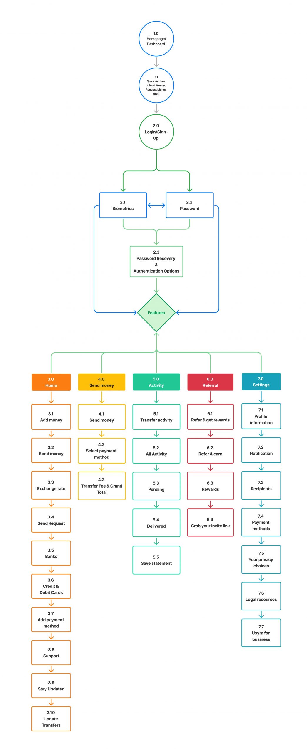
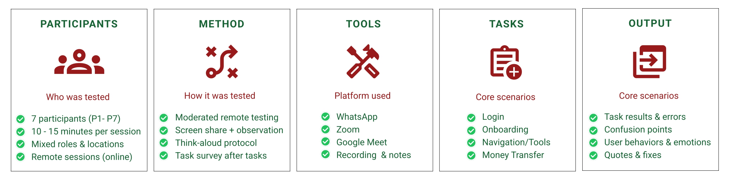
User Flow
Information Architecture
Early concept ideas
During ideation, I explored multiple directions including security-first interactions, simplified onboarding, transparent transactions, consistent multi-device layouts and a calm visual language. These concepts were refined and combined into the final Usyra experience.
A clear layout and consistent spacing reduce load, while highlighted primary actions support quick task completion.
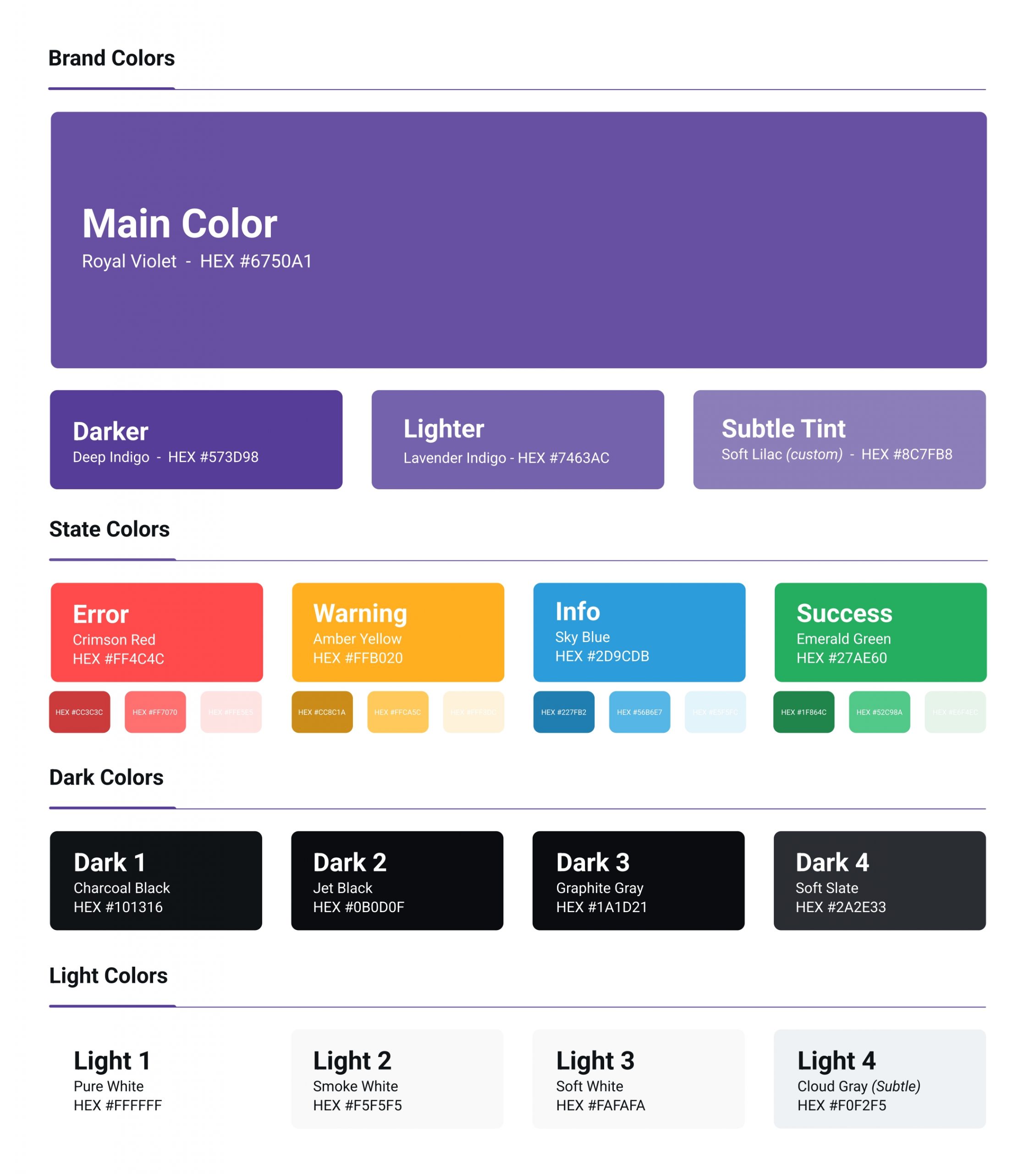
Color & Trust
A calm violet palette builds trust and professionalism, while accent colors highlight key actions and states.
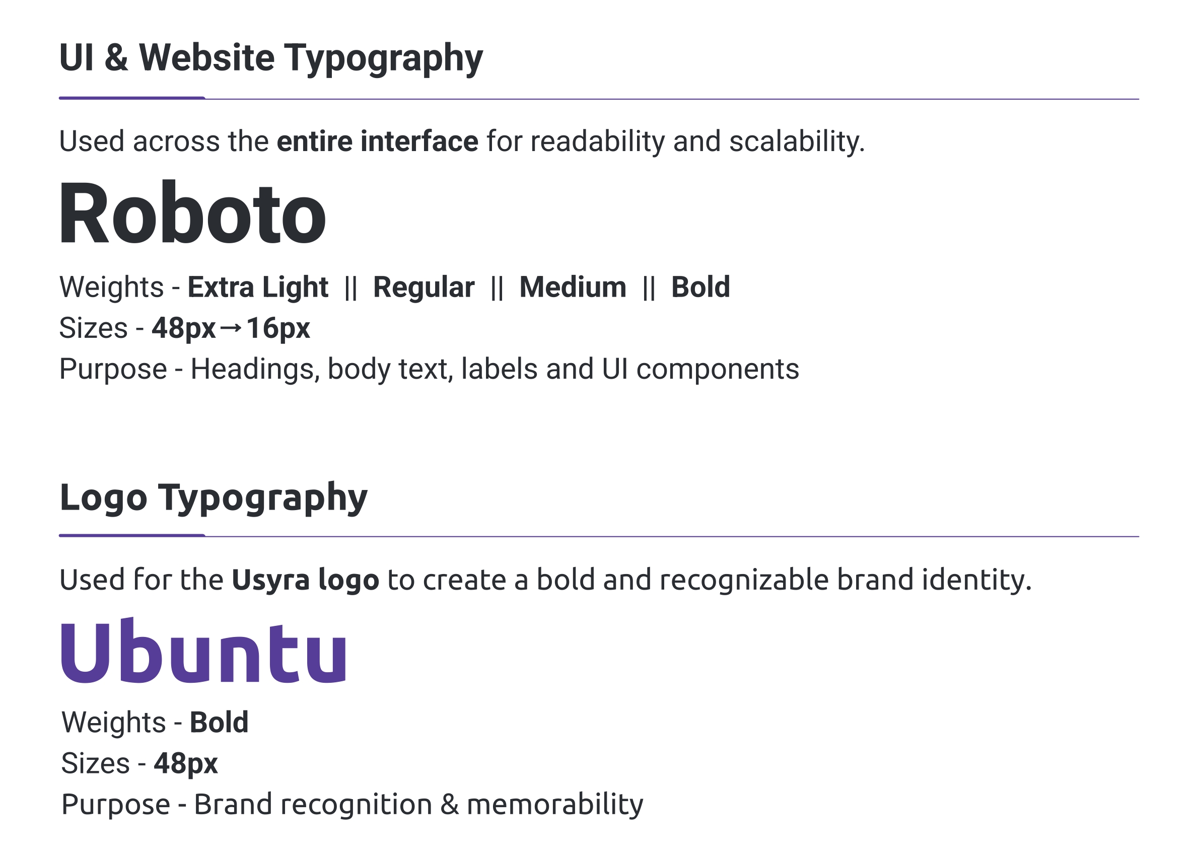
Typography & Readability
Clear typography improves readability across devices. Strong headings guide attention and comfortable spacing makes financial content easier to scan.
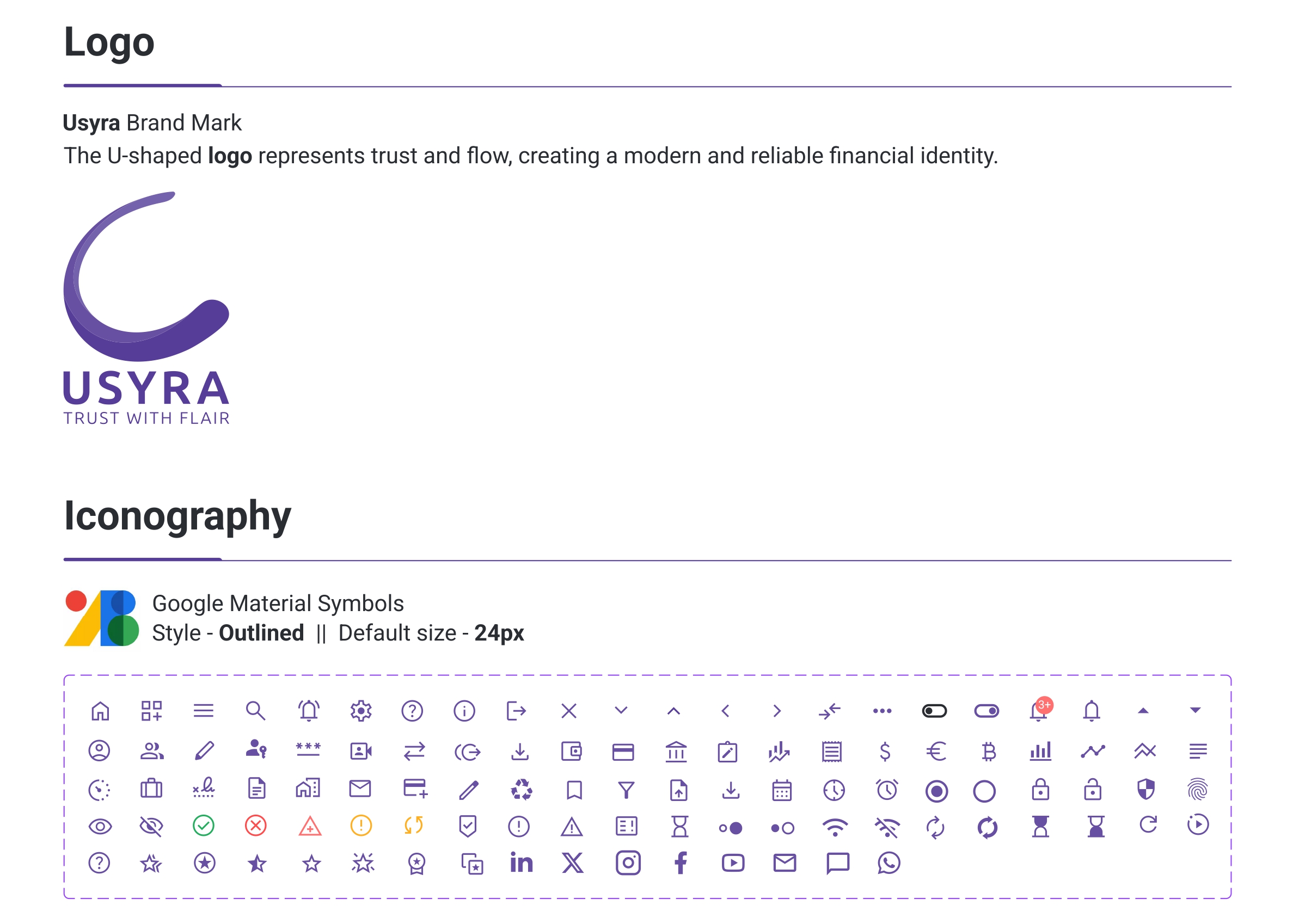
Brand Identity & Emotional Design
The U-shaped Usyra logo and Google Material Symbols create a friendly. Modern feel and build user confidence.
Accessibility Considerations
Accessibility influenced colorcontrast,font sizing and touch target spacing to ensure the interface remains usable for a wide range of users. Including first-time and low-confidence users.
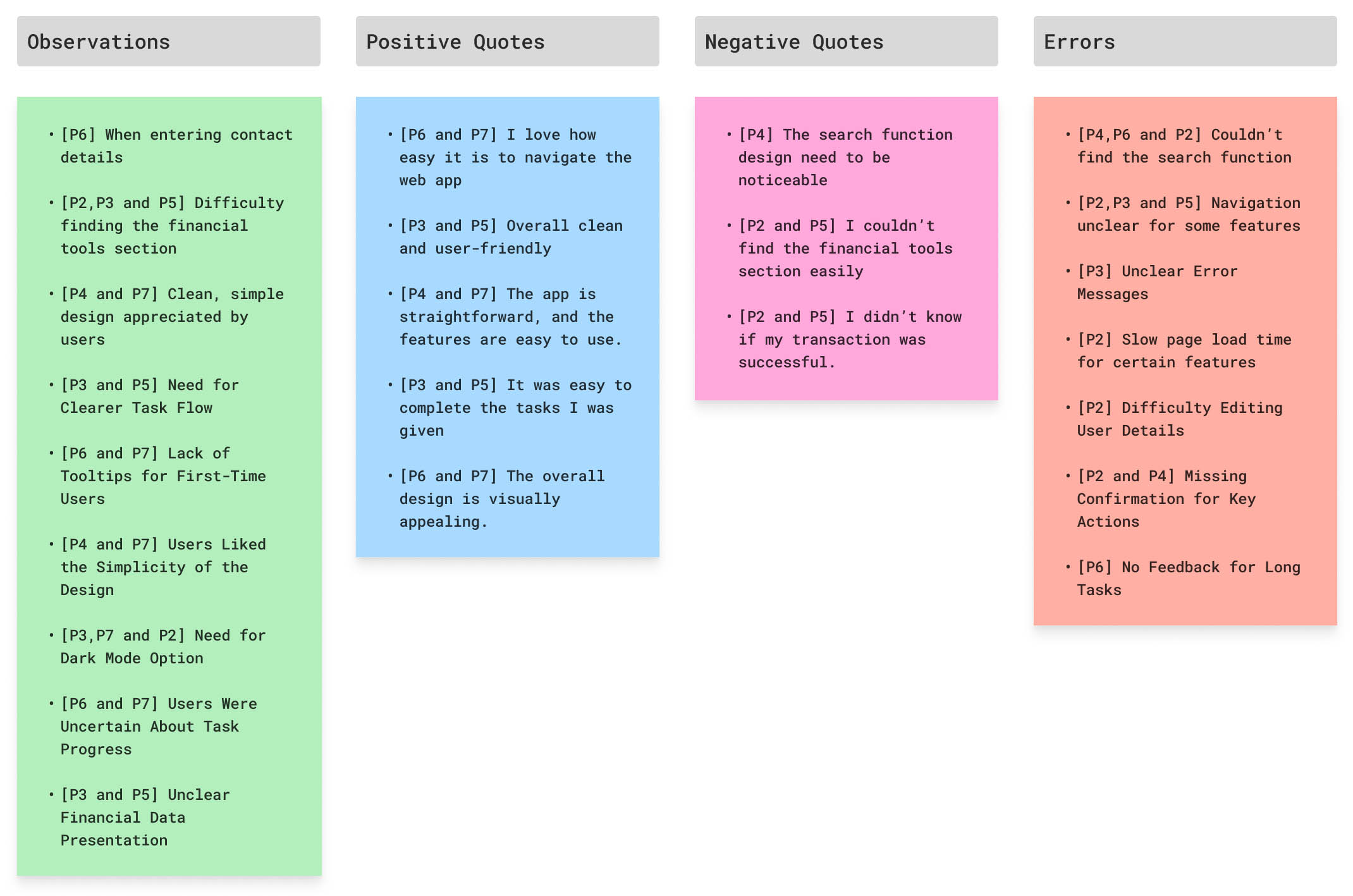
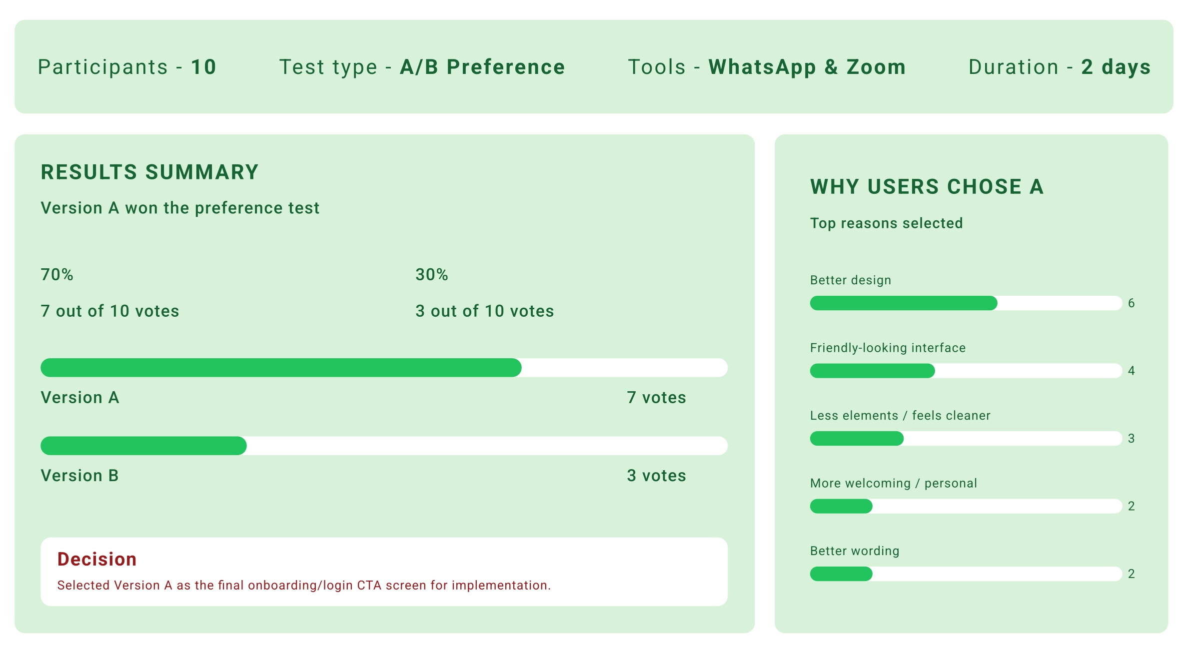
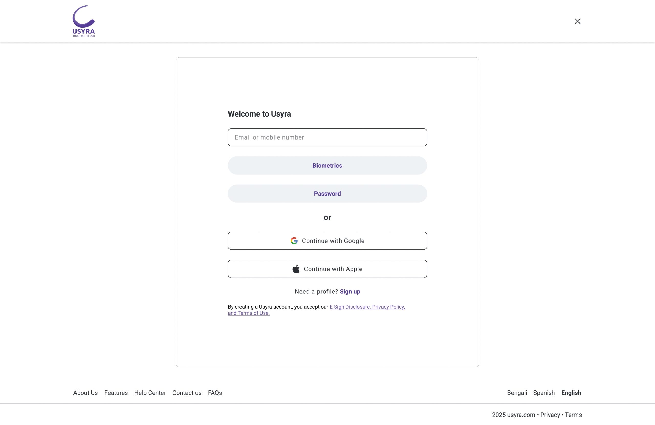
A walkthrough of the final Usyrainterface. Explaining key design decisions, core flows and usability improvements based on user feedback.
Summary of Outcomes
The final solution delivers a clear, trust-focused financial UI/UX interface. Improves task flow and user confidence and validates key design decisions through user testing.
Next Steps
Future improvements include AI-driven financial insights to support smarter decisions, a business analytics dashboard for deeper financial tracking and mobile app expansion to enable convenient on-the-go use.